 by
by Designer, craftsman, poet, and political activist, William Morris (1834-1896), was an influential force within the Arts and Crafts movement, a reaction to what was seen as the negative impact of Britain’s rapid technological and industrial advances during the nineteenth century. Morris believed in the importance of creating beautiful, useful, and well-made objects, feeling that mass production resulted in a compromise of quality and design and promoted poor working conditions.
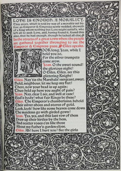
Influenced by the designs and traditional craftsmanship of medieval manuscripts and early printed books, Morris founded the Kelmscott Press in 1891. Considered the start of the private press movement, the Kelmscott Press rejected modern large-scale book production’s use of mechanized labor and sought to return to traditional printing and binding techniques practised by craftsmen. Morris sought to control every aspect of production by making his own high-quality linen paper, developing his own typefaces and ornaments, importing special ink from Germany, and printing his books on hand presses. During its seven-year run, the press produced 53 titles in 66 volumes which contained translations and reprints of medieval writings, as well as Morris’s own works.
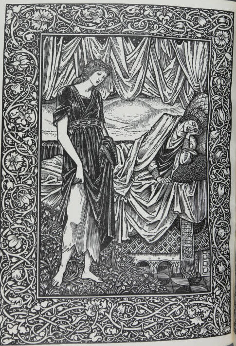
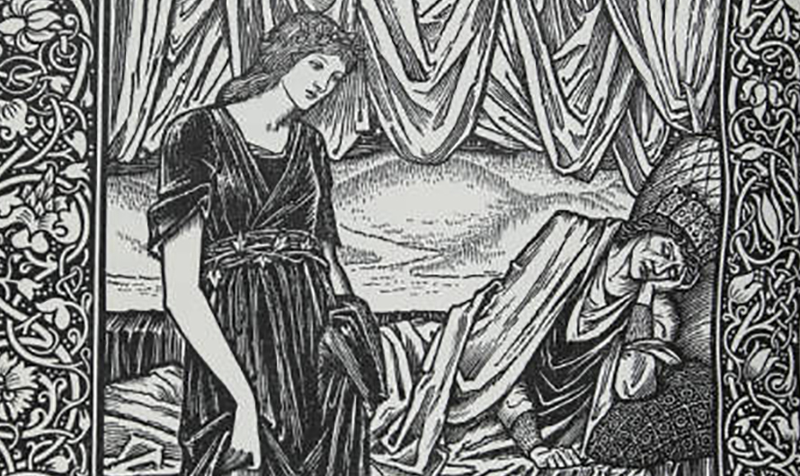
Special Collections owns a copy of the penultimate production of the Kelmscott Press, designed in 1897 by Sir Edward Coley Burne-Jones after the death of Morris the previous year. Love Is Enough, or The Freeing of Pharamond, a medieval morality play written by Morris and dedicated to his wife Jane, was issued in March 1898. It is bound in creamy white limp vellum with silk ties in imitation of a Renaissance style of binding.